
Inflow · Gen Z + ADHD Redesign
Designing for attention instead of demanding more of it.
I audited an ADHD-management app through the lens of cognitive accessibility, reworked key flows around ADHD needs, and then created a more expressive visual direction designed to resonate with Gen Z without adding new cognitive noise.
The brief
An ADHD product should not create extra executive-function work.
Inflow offers an ADHD-focused digital program with learning modules, skill-building exercises, coaching and community. That makes the interface more than a wrapper: it is part of the support system.
I used the existing onboarding and learning journeys as a case study. First, I identified where the experience relied on memory, sustained attention or unnecessary decision-making. Then I redesigned the structure for cognitive ease before exploring a more distinctive Gen Z visual language.
The order mattered: remove cognitive friction first. Add personality second.
Two audiences, one experience
Accessible enough for a distracted moment. Relevant enough to invite a return.
Reduce the cost of continuing
Make orientation, choices and next actions obvious even after attention has shifted elsewhere.
Create relevance without stereotypes
Use direct language, visual confidence and a stronger personality without chasing trends for their own sake.
Respect limited attention
Keep content scannable, interactions purposeful and feedback immediate.
01 · Audit the existing journey
Find where the interface asks users to remember, re-read or re-evaluate.
I annotated the existing screens across onboarding, module selection and exercises. The audit looked beyond conventional usability problems and asked a more specific question: where might this flow become harder when working memory, attention regulation or task initiation is already under pressure?

Unclear orientation
Users have to infer where they are and how much remains.
Competing decisions
Secondary choices dilute the next most useful action.
Reading friction
Longer or ambiguous copy makes simple moments feel heavier.
Weak feedback
Completed actions do not always create an immediate sense of progress.
02 · Define the ADHD design system
Six rules for making the next step easier.
The redesign drew on cognitive-accessibility guidance and ADHD-specific friction found in the audit. These were not decorative principles; they became decision filters for every screen.
State the purpose
Use headings and microcopy that make the current task immediately understandable.
Show progress
Make completed, current and remaining steps visible so users can reorient after distraction.
Chunk the content
Keep one idea per block and put the most useful information first.
Prioritise one action
Give the next best step visual dominance and quieten secondary paths.
Give quick feedback
Acknowledge success immediately to reduce doubt and support momentum.
Make recovery easy
Keep back, edit and reset paths visible so a mistake never feels like a dead end.
03 · Redesign the structure
Less reading. Less remembering. Less deciding.
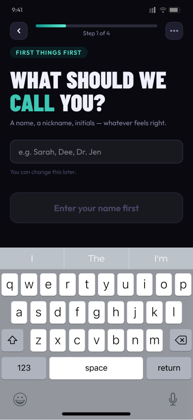
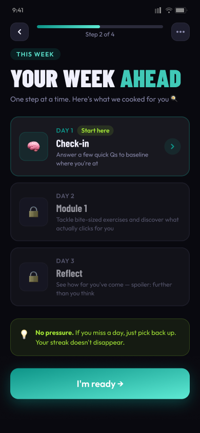
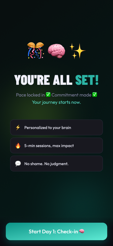
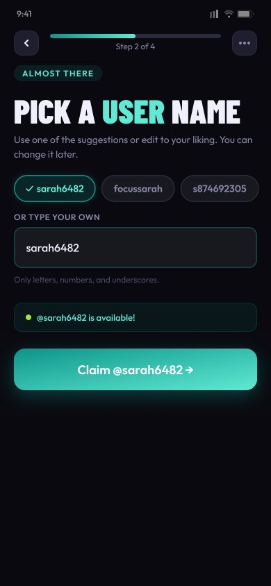
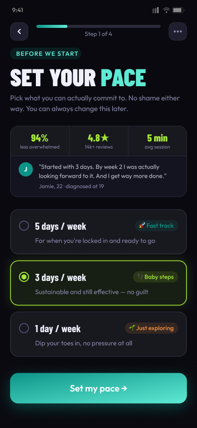
I first kept the visual language relatively familiar so I could isolate interaction improvements. The onboarding flow gained clearer progress, shorter prompts, stronger hierarchy, more forgiving choices and immediate acknowledgement.
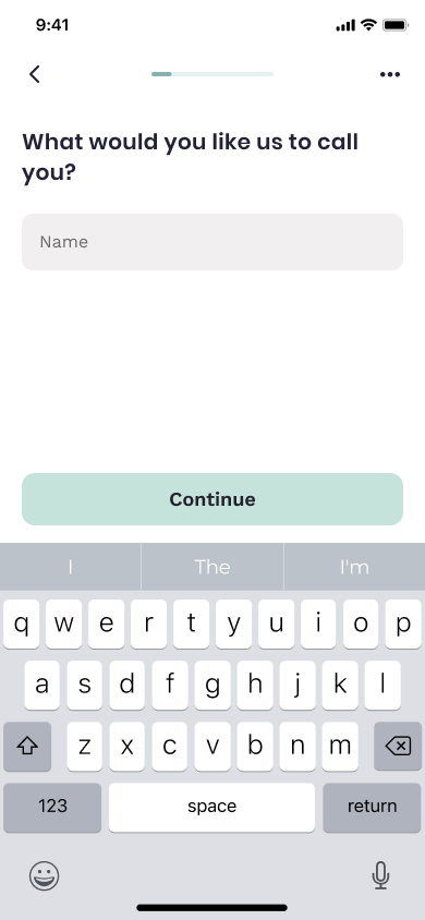
Reorientation built in. The task, current step and future editability are visible at a glance.
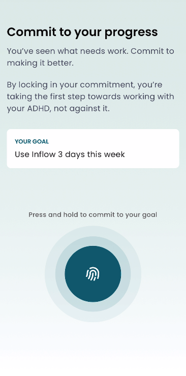
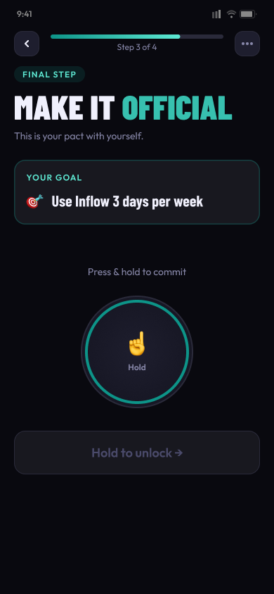
Commitment made concrete. The goal stays visible and the interaction explains exactly what happens next.
Explicit stage labels and visible progress replace implied context.
Short, specific prompts replace language that requires interpretation.
One primary next step leads; secondary options remain available but quieter.
Immediate acknowledgement turns each completed step into visible momentum.
Back, change and reset options stay accessible without punishing mistakes.
04 · Add the Gen Z layer
Personality that helps focus.
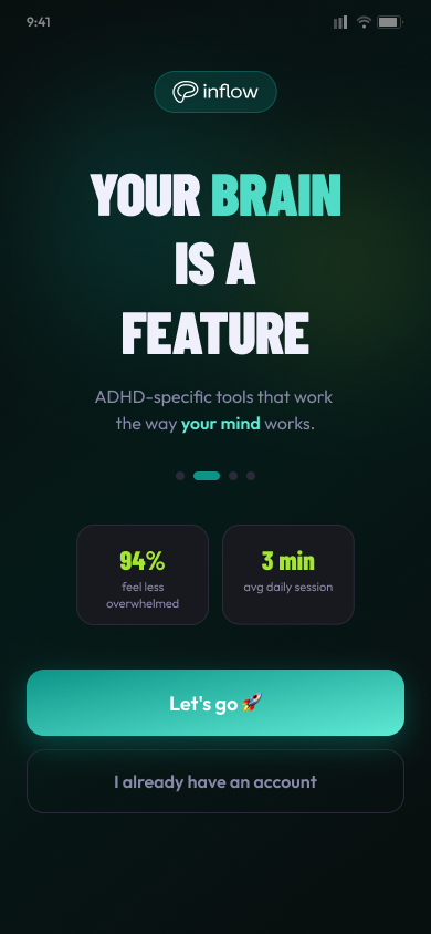
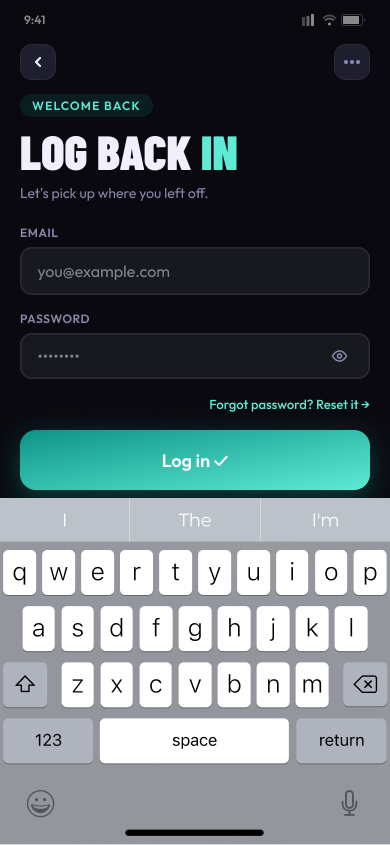
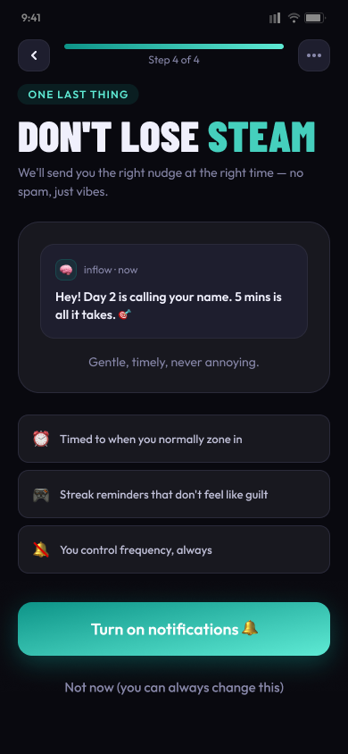
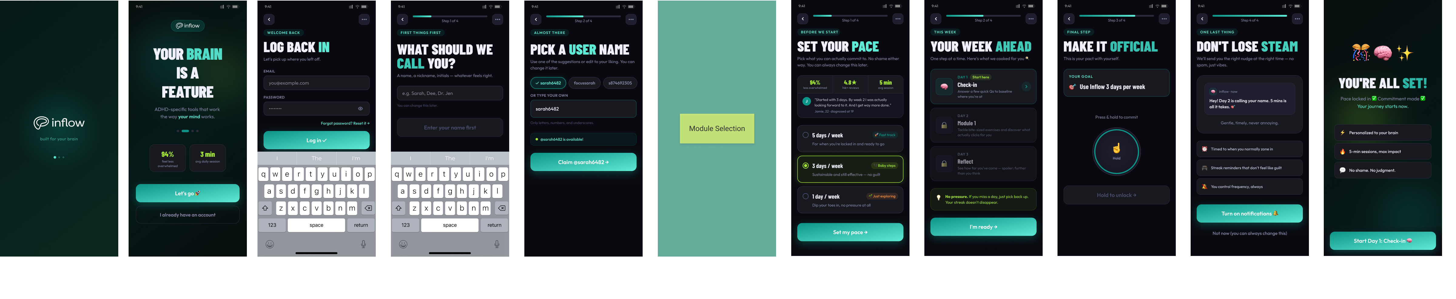
The visual redesign shifts the product away from a conventional clinical aesthetic. Bold typography, high contrast, direct microcopy and a mint gradient create more energy and cultural relevance while the underlying ADHD-friendly hierarchy stays intact.
Large display type creates a clear entry point without filling the screen.
Human prompts feel supportive and specific rather than clinical.
Dark surfaces and a bright accent keep hierarchy immediately legible.
Visible progress and focused screens turn a long journey into manageable moments.
The working file
Audit → structure → expression.
The Figma file keeps the reasoning visible alongside the screens: original journeys, annotations, structural redesigns and the final visual exploration. That makes the project useful as a design argument, not only a collection of polished mockups.
Product context: Inflow’s official product overview. Cognitive-accessibility reference: W3C WAI supplemental guidance.
The result
A stronger design hypothesis ready to validate.
The redesign demonstrates how an ADHD-focused product can lower cognitive effort while still feeling expressive and relevant to a younger audience. The structural system supports orientation, momentum and recovery; the visual layer adds confidence and personality without undoing that work.